信息與控制工程學院成功舉辦校園程序設計大賽——計算機網絡工程設計專項賽

為提升學生實踐創新能力,信息與控制工程學院于近日成功舉辦了校園程序設計大賽計算機網絡工程設計專項賽。本次比賽吸引了來自計算機科學與技術、軟件工程、網絡工程等多個專業的近百名學生參與,充分展現了學院在信息技術教育方面的深厚底蘊。
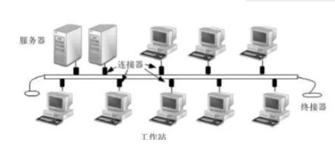
大賽以“智能網絡,安全未來”為主題,要求參賽選手在限定時間內完成網絡拓撲設計、協議優化、安全防護等綜合性任務。比賽過程中,選手們運用所學知識,結合當前網絡技術發展趨勢,設計出多套具備高可用性和可擴展性的網絡工程方案。評委組從技術實現、創新性、實用性及文檔規范性等多個維度對作品進行綜合評定。
經過激烈角逐,最終評選出一等獎3組、二等獎5組、三等獎8組。獲獎作品在負載均衡、SDN技術應用及物聯網安全等方面展現出獨特見解,部分優秀方案已獲推薦參加省級競賽。
學院負責人表示,此類專業競賽不僅強化了學生的工程實踐能力,更促進了產學研深度融合。未來學院將持續完善競賽體系,為培養高素質信息技術人才搭建更廣闊的平臺。
如若轉載,請注明出處:http://www.xyhs1111.cn/product/40.html
更新時間:2026-03-06 07:25:13